How to create exhibit labels or placards for an exhibition
May 19, 2024
Exhibition labels are crucial in communicating essential information about the displayed artworks. In this article, we will explore the vital elements of creating practical and functional labels that enhance the visit to your exhibition based on our experience designing and setting up exhibitions.
- What are exhibition labels?
- Research and detailed content
- Language consideration
- Attractive and consistent design
- Data verification and error correction
- Interactivity
- BONUS: Production - Materials and Sustainability
- BONUS: Accessibility
What are exhibition labels?
Exhibition labels are more than simple labels of artworks or objects. They are small-format informative tools connecting the viewer with the artwork as they navigate any exhibition.
Beyond informative panels or the artworks themselves, exhibition labels provide clarifying details, the final element through which the artworks speak. Their small size conceals technical information as important as the date, origin, and author of a piece, something of interest to the general public and researchers or experts. And that's why exhibition labels should be functional for both.
Research and detailed content
The first step in producing exhibition labels is to generate the texts and content. Research each exhibited artwork or gather information from the catalog or corresponding software (such as Museumplus, for example) to provide detailed information, including historical context, technique used, and inspiration behind the artwork.
If there is more than one object in the exhibition, it is essential to consider coherence in the content; visitors will expect to find a similar type of text. Therefore, if you have decided that your exhibition labels will contain the title, author, and year, try to maintain this basic structure for all the labels as much as possible.
To enrich the content, exhibition labels can include quotes or complementary content to understand better the exhibited objects and their connection to the exhibition.
Language consideration
When writing exhibition labels, use accessible language to make the information understandable to all visitors. Adapt the tone and vocabulary to the target audience of your exhibition, and if necessary, prepare two levels of information to reach a more or less specialized audience.
Divide the text into paragraphs or sections to facilitate reading. A clear structure will allow visitors to absorb the information effectively. Use paragraphs to break the text; this will help avoid dense blocks of text and make the information more digestible.
Remember that exhibition labels are small elements providing relevant and concise information about each artwork or object. We recommend avoiding unnecessary details and focusing on the highlights. Use the rest of the exhibition panels to offer longer texts.
Attractive and consistent design
The design of exhibition labels should be attractive and consistent with the exhibition's look and feel. Use easily readable fonts, colors that complement the artwork, and graphics highlighting important details if necessary.
Legibility is essential to ensure that visitors can read the information effortlessly, so select fonts that facilitate reading and colors that contrast with the background. To maintain a suitable balance in the length of the text on exhibition labels. We recommend using 10 to 25 words per line to help readability.
A final tip is to prioritize functionality in your design: remember that the function of exhibition labels is to inform, so even if you can add extra graphic elements, ensure they do not distract visitors from the essential information the labels need to convey.
Data verification and error correction
Before printing the final exhibition labels, verify all data. We recommend providing the files to multiple people to check for possible errors.
The most error-sensitive elements are typically:
- Typographical errors
- Errors in dating the pieces
- Inappropriate text size
- Low color contrast between text and background
You can make a printed test to ensure everything is correct, and pay special attention to these details before publishing the final files!
Interactivity
As mentioned, exhibition labels are small elements that must contain brief and concise information, but what happens when we want to incorporate a large volume of information? We can always include QR codes or links that redirect to additional online content. You can link to artist interviews, videos of the creative process, virtual galleries, translations into other languages, or any complementary multimedia material.
Generating QR codes is a simple process, and many free online tools will allow you to experiment with this method...
BONUS: Production - Materials and Sustainability
At Misterio Studio, it's essential to consider environmental sustainability criteria in the production of any exhibition. From our experience, it's equally possible to design exhibitions of different kinds while trying to reduce our carbon footprint more and more.
Before delving into this point, keep in mind that producing labels (or any other element for your exhibition) will impact the environment. With that in mind, your goal is to minimize the footprint in production as practically as possible.
Consider the lifespan your labels should have: are they for a permanent exhibition or a temporary one? In the former case, you're interested in having durable and resistant labels so you only need to produce them once. Although the initial environmental impact may be more significant in this case, you will extend their useful life in the long run.
If, on the other hand, they are for a temporary exhibition and durability is not as relevant, consider using recycled or biodegradable materials and avoid using non-recyclable resins, glues, or plastics.
BONUS: Accessibility
We believe that culture should be accessible to all audiences, so considering accessibility criteria should be a must for all exhibitions in the 21st century.
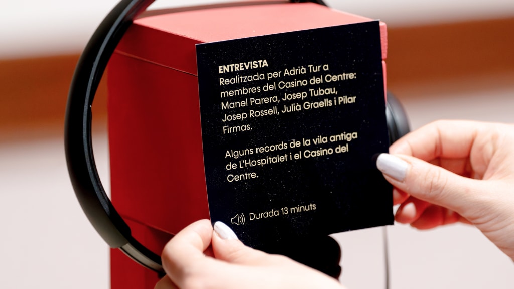
Labels are elements that can be adapted for people with different cognitive abilities. Including messages in braille can be implemented easily thanks to 3D printers. Generating audio content can be an equally valid solution for blind individuals and for offering various languages during the visit.
The location of the labels will also play a crucial role in their perception. Although finding the ideal place for everyone is not easy, we recommend that you conduct tests to find a location that allows viewing by all visitors, including those who use wheelchairs or children who are shorter in height.
Creating effective labels is a fundamental part of curating and designing an exhibition. In this article, we've provided some insights into the journey for their design and implementation.
Remember, well-designed and written labels can convey key information for the exhibition and enhance the overall experience perceived by its visitors. Please don't leave them for the last minute!